
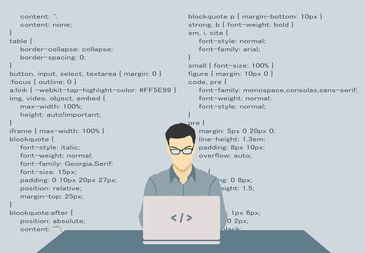
Mobile First Strategy for Websites and Digital Marketing
Let’s assume you have a phone, a tablet and a desktop or laptop computer. Which machine do you spend the most time interacting with? What about on a personal, non work-related level? More than half of the web pages accessed in 2017 were done so on mobile. If you’re a business, that means you’re probably already well aware of mobile first design.
Pick Up the Phone, The Future is Calling
In a nutshell, mobile first is the idea that a business should design its website for a mobile platform. To be clear, this doesn’t mean a website should ONLY be designed for mobile—ideally, the design should reflect the platform. But as a starting point, it’s easier to design for mobile first and then blow the design up for desktop. It’s much harder to strip down a desktop version of a website to make it mobile compatible.
Is It Worth the Effort?
https://www.youtube.com/watch?v=LMAATive5lY
Sometimes it’s obvious that a website has been designed for one platform and looks bad or doesn’t function well when it’s transferred to another. It feels like a square peg forced into a round hole. Mobile first is a design decision that forces a business to prioritize what a customer needs. What’s the most important content? The result is a lean, clean version of your desktop site. We can relate to this paring down because we often provide cut-downs of the videos we produce for clients. It’s like taking a three-minute video and producing a 30- or 60-second version.
So how do you prioritize? Think about the user experience. Make sure your mobile site allows for zoom, double tap, and pinch functions. A mobile user expects this functionality, so make sure it’s there. Think less is more. Consider how a short paragraph looks on a desktop…and how it looks on your phone. Replace text with pictures whenever possible. Trying to cram too much into a page makes it long and difficult to navigate. Use links and a menu to send the user to the right page and keep things neat. And remember that cross-platform compatibility ensures you don’t lose a customer toggling between mobile and desktop.
Which Comes First—Desktop or Mobile?
If you’re considering building a website, this is an important question. Responsive web design is a method that allows one site to respond and convert to whatever device is being used for viewing. This is opposed to a traditional “fixed” site. The conversion means the user will be able to navigate as intended on their chosen device.
If you have a fixed site, there are a couple of methods when it comes to conversion for various devices. First is progressive enhancement. This kind of web design starts simple and builds to more advanced function and features. That could mean beginning with a mobile design and then creating more complicated tablet and desktop versions. The UX will be built out by adding things like interactions and effects.
Starting from the other end is called graceful degradation. This is a way of addressing out-of-date browsers and use on different devices. So the latest and greatest top-end website designed for a desktop can have poor functionality on mobile or when used with an outdated browser. So instead of enhancing features, the designer is stripping down features.
Video for Mobile
This blog is all about web design, and a big part of websites is video. Key West Video can make sure your production is optimized for your website and for mobile. Or for any other platform necessary. Call us today for a free quote.