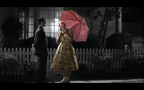
Sepia, Black & White or Colour: When planning out your company’s commercial video, have you ever wondered which you should use?
Producing a useful, appealing, and attractive video takes special consideration. Sound, lighting, costumes, and music are some of the aspects you should keep in mind when making your video. The question of how or when to use color, black & white and sepia tone are just as vital!

COLOR
Writer of all things film, @RobertMills comments how #color is, “being used as a storytelling device in movies, ranging from tints and filters, specific objects, transitions and symbolism, costumes and everything in between.” (Mills, Robert. “Colour and Storytelling In Films.” July 28, 2013. Web. September 2014.) The amazing thing about color is that it can help set any mood. The happier the scene, the brighter the colors could and should be.
For example, when producing a video for a product or company, it is important that everything that surrounds the product or focus be complimentary. Just like you take time and care to put together your outfit when you get dressed in the morning, you do not want colors and textures clashing on screen.
Equally as important is the shades used. Brighter shades such as yellow, orange and red bring on feelings of happiness and excitement in a viewer, while earthy neutral tones like greens, brown or beige will induce feelings of calm and relaxation.
It’s important always to keep in mind what feeling you want the viewer to have while viewing your video! It’s crucial to remember what is pleasing to the eye.
http://youtu.be/HMSv0GtzCDk
BLACK & WHITE
#RogerDeakins, the Director of Photography on several #CoenBrothers films has an interesting opinion on the matter:
“Black-and-white focuses you on the content and the story, and it really concentrates your attention on what’s in the frame. All too often, color can be a distraction — it’s easier to make color look good, but harder to make color service the story. Black-and-white imagery is much more about the balance between the light and shade in the frame, and I think it can help convey story points a lot better with fewer distractions.” (Mills, Robert. “Colour and Storytelling In Films.” July 28, 2013. Web. September, 2014.)
One of the reason’s why #Black&White is useful, instead of color, for flashbacks, memories, or re-enactments. Companies should keep in mind that the content needs to shine, not just the shade of blue, purple or green! Black & white causes viewers to pay extra attention to the content as the visual offers no bright and shiny distractions. When relaying valuable information, such as warnings and things to be cautious of, you may notice videos often switch from full color to black & white.
SEPIA
#Sepia gives a black & white photographic print a warmer tone and enhances its archival qualities. Sepia is a great alternative when you want your video to appear more sophisticated or nostalgic. It’s a step-up, from the usual black & white and a great break from the norm.


